Hello
Everyone,
A minor update and it may be coming a little early but we thought we would get it out of the way. Basically we had been toying with the idea of having whoopee cushions as business cards but there were so many limitations we decided to make our business cards a little more "standard". That being said we wanted something that would stand out and would somewhat reflect our short... When googling Stitch found the perfect reflection of one of Benjamin's gags...
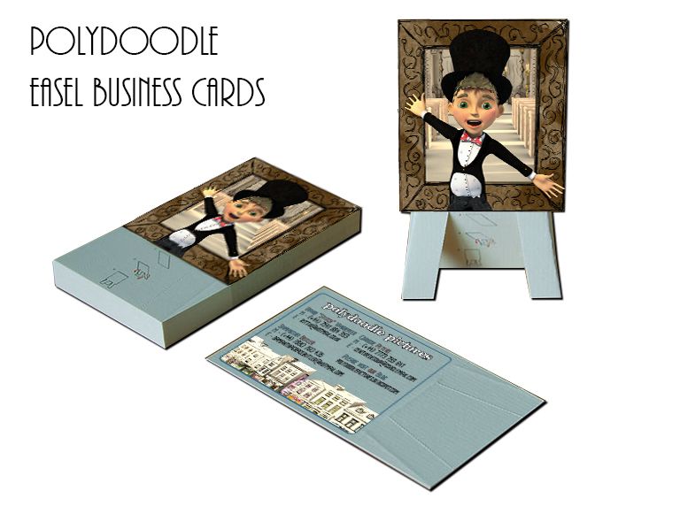
It is one of Benjamin's more controversial gags of the short but we found it kind of poetic that we are Polydoodle "Pictures". We will probably be knocking them over in accordance with the short... Just kidding. Anyway on the front is the picture frame from our short with Benjamin standing in front of it. The scene in the picture is the interior church which is where its knocked over. On the back are all of our details with the blog address... Pretty simplistic really but it looks cool.
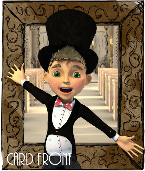
The image above shows a close up of the front of the card. The render itself was taken from Shot 57 of our actual short in a certain "Tah Dah" moment. Again its quite ironic because its this pose that causes the chain reaction which knocks the portrait over. Anyway we figured this was a healthy alternative to trying to crush details onto a whoopee cushion no matter how funny hearing farts around new designers would be.
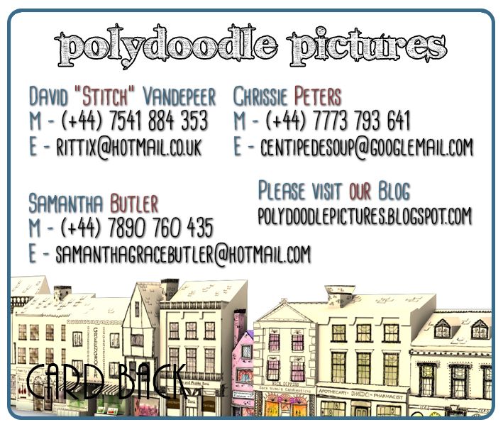
Last but not least is the back of the card which has each member of Polydoodles mobile and email details. This is just in case anybody wants to get in touch with us in the future. Obviously that's the whole point of the card but we like to think the easel will make it more interesting then your standard run of the mill card. We put some of the buildings from the exterior parlour just to break up the blandness of the text. Anyway that should do it!
Catcha soon!
xXStItChXx


So you went with the Norwegian person's card design :)
ReplyDelete