Hello Everyone,
You will probably all call me crazy but I suppose what else is new. I spent a bit of today knocking about a hat design for our T Shirts (something to make the logo "& Son" ours - unique to us). I first set about looking for Hat models to give me a basic hat shape to work from (trying to save time). Once I found one I put it in ZBrush and distorted it shaped it differently (making it much longer). I wrapped it up with a nice little flower stuck in the hat (which is actually a gag flower - not a real one). After that I thought "as I'm already in ZBrush why not try to composite some layers?"
I did just that being fully into it since Phil asked me to do the Driver last week. This post will show all of the render layers I used in creating the final outcome. The beautiful thing about working in render layers is you can change the colour of shadows/lights, anything because it is all separate. You can mask sections of the hat allowing you to paint that section only or exclude it from other layers. It gives you full licence to make the image something different just by tweaking values and adding splatters of paint here and there... Seriously its powerful stuff!!
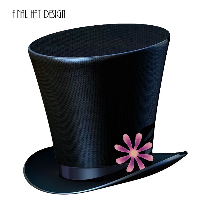
Below you will see the final hat and then everything that led up to it!
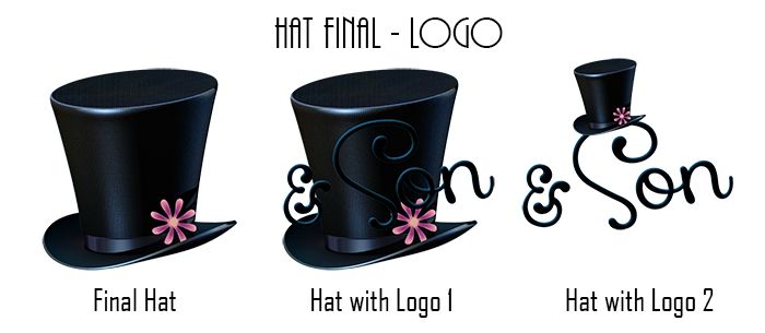
The image above is the final hat on its lonesome... This of course was tweaked and adjusted from a number of render layers allowing me to slightly tweak certain aspects including light colour and opacity, material, depth strength, colour raw/Photoshop & reflectivity. I could even use the FX controls to adjust hues of shadow and light or drop slight shadows behind the hat itself. The control by doing compositing (or Weta) is certainly astounding I love it. The hat design itself is slightly elongated. In case there was any question this is Benjamin's hat...
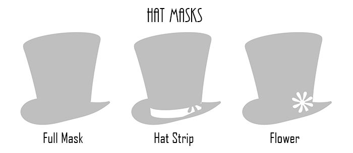
First in this process is the masks, its handy to have poly-groups so you can split the mask into sections you know will hold a different material (which means different reflections, colours, etc.). The hat was simple as it only had a band which I knew had to be slightly darker and maybe a little more reflective then the main body of the hat. Then you have the slower which I made really bright and gave it a skin shader material which I found worked quite well giving the colour some heft without too much reflectivity. Anyway after you have the masks you get to the individual basic passes.
These are the basic passes I used, now you don't necessarily always need a beauty but in this case I wanted it as I wanted the materials which I coated the hat in. I also wanted to be able to adjust them individually. That's where the masks came in allowing me to cut the colour of the slower out and use it as and when. It also allowed me to change the colour of the flower if I wanted without effecting the rest of the hat. I used ZBrush's colour brush which throws random colours in with your chosen shade to give it some variety. I didn't want to paint it too much yet... not until I go into modelling mode.
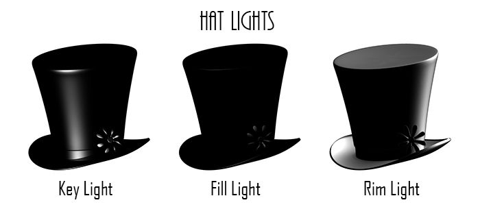
Next came the lights for the hat which boiled down to the basic 3 - Key, Fill & Rim. I got the idea for these from a handy author on the ZBrush forums who has to have composited renders for his portfolio. Basically the key is your main source of light while the fill connects the disparity of light between the key and the rim. The rim is to show the opposing side so it doesn't just sit in darkness with a shine on one end. I lowered the opacity on it but you can see it on the final design. The big mistake I made was not getting enough light on the flower... Oh well, next time.
This led to the final hat design where I coloured the flower slightly different and garnished all the lights with a blue tint. I added Sammy's logo (tilted) and punched up some of the darker blues giving it a strong blue drop shadow at its lights source. The ladies thought it was too dark but I dunno I still prefer it bigger, especially if it printed how my screens said it would. We came to an agreement by putting a smaller rendition of the hat on the text itself (they were worried that people would not be able to see the dark text in front of the hat - which is fair enough).
Afterwards we laid the designs out on the spreadshirt.co.uk/ website and got the little beauties printed. Well they should be here by weds or Thurs just in time for pitch day... I will probably be pulling a super man (changing my shirt in the shower as Chrissie is the orderee). Anyway I bet you wouldn't have thought there would be so much hassle over a single hat but I proved that you can do one of my posts based on it especially if your working with render passes. I am actually quite chuffed with the design of the hat too, it was kind of a fly by your pants moment for me, the flower was inspired from one of my earlier designs...
Anyway I have a number of other things to do tonight and for the rest of this week but I thought I would knock this up just because it looks pretty cool. Its given me enough confidence to crack on with the rest of the stuff urgently. I am actually glad I sat down to do those Driver images for Phil they really gave me the idea of doing a composited hat for concept.... This is the first prop design I have created that I am actually happy with so that's kind of new... ha-ha. Well the pitch is not far away and we are doing good... catch you dudes later!
Over & Out,
xXStItChXx




No comments:
Post a Comment